

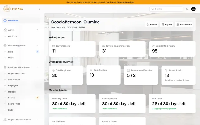
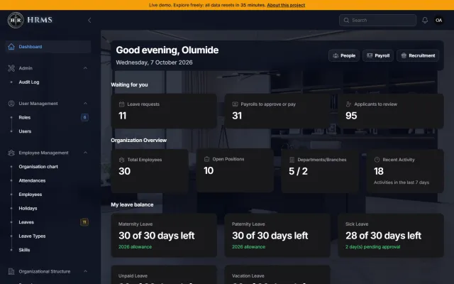
HR Management System
Laravel · Web · Archived
Laravel and Filament HRMS covering employees, attendance, leave, payroll with PDF payslips, and recruitment.
25 Blade components power this site. Everything below is rendered by the real thing, so it follows your realm and colour mode: try the realm switcher and the Light/Dark toggle in the header, then open any demo's code.
Design tokens are CSS variables, so all 9 realms and their 18 light and dark themes work everywhere.
Live OKLCH values: change the realm or switch Light/Dark in the header and these update.
--bg
--bg-alt
--surface
--surface-strong
--text
--muted
--accent
--accent-2
--accent-text
--on-accent
--success
--danger
--warning
--info
Each realm brings its own fonts. This one uses its display font for headings and its body font for text. Fluid sizes, balanced wrapping.
Display heading
Lead paragraph: larger, muted, comfortable line length.
Body text in accessible accent links and strong emphasis.
Small, muted supporting text.
Eyebrow labelHover each box. Reduced-motion users get no movement at all.
--dur-fast 150ms
--dur-base 300ms
--dur-slow 600ms
Buttons, badges, chips and pills.
<x-badge>Default</x-badge>
<x-badge variant="hot">Hot</x-badge>
<x-badge variant="success">Active</x-badge>
<x-badge variant="danger">Expired</x-badge>
<x-badge variant="info">In progress</x-badge>
<x-badge variant="muted">Muted</x-badge>
Chips are toggleable (aria-pressed); pills are read-only.
{{-- Toggle chips: aria-pressed drives the style --}}
<button type="button" class="chip" :aria-pressed="selected.includes('Laravel')" @click="toggle('Laravel')">Laravel</button>
<span class="pill">Pill (read-only)</span>
Always-visible labels, hints, and errors wired to inputs with aria-describedby.
Default, valid and error.
We never share it.
Looks good
Enter a valid email.
<x-field name="email" label="Email" type="email" :required="true" />
<x-field name="email" label="Email" :valid="true" value="ada@example.com" />
<x-field name="email" label="Email" message="Enter a valid email." value="ada@" />
<x-field name="type" label="Project type" as="select" :options="['Web app', 'Landing page']" />
<x-field name="details" label="Details" as="textarea" hint="Be as specific as you can." />
Be as specific as you can.
At most one a month.
<x-toggle name="updates" label="Email me updates" hint="At most one a month." :checked="true" />
Leave fields empty and press Validate (nothing is sent).
<form x-data="contactForm" novalidate @submit.prevent="...">
<x-field name="name" label="Name" :required="true" />
<x-field name="email" label="Email" type="email" :required="true" />
<x-field name="message" label="Details" as="textarea" :required="true" />
<button class="btn btn-primary">Validate</button>
</form>
{{-- Inline errors, focus on the first error, aria-invalid + aria-describedby; the server stays the source of truth. --}}
Alerts, toasts and loading states share one status palette.
Warnings and errors are announced immediately (role=alert); info and success politely.
Heads up
Saved
Careful
Something failed
<x-alert variant="info" title="Heads up">Informational message.</x-alert>
<x-alert variant="success" title="Saved">It worked.</x-alert>
<x-alert variant="warning" :dismissible="true">Careful with this.</x-alert>
<x-alert variant="danger" title="Something failed">Try again.</x-alert>
Spring entrance, auto-dismiss (paused on hover), Escape clears all.
{{-- Once per page --}}
<x-toast-host />
{{-- From anywhere --}}
<button @click="$dispatch('toast', { title: 'Saved', body: 'Your changes are live.', variant: 'success' })">Save</button>
Nothing here yet
Empty states say what is missing and what to do next.
Live status dot
<div class="skeleton h-24"></div>
<span class="pulse-dot text-success"></span> Live
Cards, stats, tables and disclosure.
Surface, border and soft shadow.
For links: the border answers the pointer, nothing moves.
The active realm's pattern and film grain, for emphasis.
<x-card>Plain card</x-card>
<x-card :hover="true">For links: the border answers the pointer</x-card>
<x-card class="aurora grain">Realm texture + film grain</x-card>
Live: the first published project from the database.
Laravel · Web · Archived
Laravel and Filament HRMS covering employees, attendance, leave, payroll with PDF payslips, and recruitment.
<x-project-card :project="$project" :index="0" />
{{-- level="2" when the card sits directly under an h1 (keeps heading order). --}}
A number only earns a tile when its label says what it counts.
<dl class="grid grid-cols-2 gap-6">
<x-stat label="Case studies" :value="3" :index="0" />
<x-stat label="Certifications" :value="23" :index="1" />
</dl>
| Page | Performance | Accessibility | SEO |
|---|---|---|---|
| Home | 98 | 100 | 100 |
| Projects | 99 | 100 | 100 |
| Case study | 96 | 100 | 100 |
<div class="overflow-x-auto">
<table class="w-full text-left text-sm">
<caption class="sr-only">Release history</caption>
<thead>...</thead><tbody>...</tbody>
</table>
</div>
Height-animated disclosure; the button owns aria-expanded.
Yes: WCAG 2.2 AA, keyboard operable, reduced-motion aware.
Pick a realm and Light or Dark from the header; every colour is a theme token (a CSS variable).
In the database, edited in /admin.
<div x-data="{ open: false }">
<button :aria-expanded="open" aria-controls="faq-1" @click="open = !open">Question</button>
<div id="faq-1" x-show="open" x-collapse>Answer</div>
</div>
Device frames to show work consistently.
I build digital realms where code, story and identity meet.
<x-device-frame url="durolord.com">
...any markup...
</x-device-frame>
Akinbo Oluwadurotiwa's Reading Report
<x-device-frame device="phone" :flush="true">
<p class="bg-accent px-4 py-3 text-sm font-semibold text-on-accent">Reading Report</p>
<x-toggle name="day-98" label="Day 98 reading done" :checked="true" />
</x-device-frame>